Customers use all sorts of devices to make online purchases these days. In fact, 38%Â of the traffic to our event pages come from mobile devices.
Sure, plenty of sales still come from the trusty home computer, but what about the customer who loves the convenience of buying something on her phone?Â
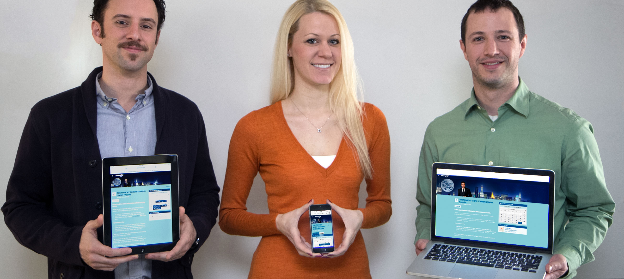
Enter responsive design — an approach to web design that dynamically arranges elements of a page based on size and width to provide a consistent experience on any computer, tablet, smartphone or other web browser.
We know that fast, convenient ticket sales are a priority for you, so we applied these responsive design principles to our event pages. No matter how your customers wind up on the page, it will automatically adjust the most important elements to make it easy to find and buy tickets with the same simple checkout process.
Want to see an example of our responsive pages? Check out this page for The Tonight Show Starring Jimmy Fallon.
If you’re viewing the page on your home computer, click and slowly drag the bottom right corner of your web browser to the left.
As you narrow the width of your browser, you’ll be able to watch all of the page elements snap into place, which gives you an idea of how it would look on a tablet or the slim width of a smartphone’s browser.
(You can also try this out with the blog right now!)
Your customers won’t have to get frustrated with manually zooming in and out just to find a button to buy tickets (and your pages will look pretty great, too).
Try it out for yourself and set up your next event today! (Not a ShowClix client? Get in touch with one of our ticketing experts to set up your account.